Introduction
Heat maps are like X-ray vision for your website, showing you through colors where people are clicking, scrolling, and spending time. These colorful representations help businesses make better decisions, improve website usability, and optimize their strategies. Curious to see what draws the most attention? Let’s clearly understand how heat maps work.
What is a Heat Map?
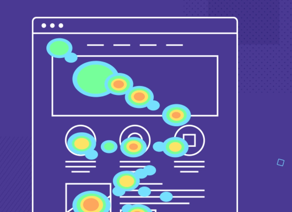
 A heat map is a tool used in data visualization that helps to show data points on a map or chart using colors. Think of it as a map that uses temperatures to show different levels of activity or values represented; areas with a lot of activity show up as warm colors like red, and those with little activity show as cooler colors like blue. This makes heat maps extremely useful for seeing complex data in a simple way. Just by looking at the color schemes, you can quickly spot which areas are getting the most attention or where users spend the most time. Heat maps are generally used in business analytics to improve decision-making for a site or page by analyzing patterns and behaviors properly.
 Different Types of Heat Maps
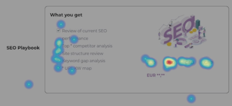
Heat maps come in several varieties, each customized to visualize data related to specific behaviors or interactions. Here are the various types of SEO heat maps and how they can be used effectively: Click Heat Maps: These maps are essential for understanding exactly where users are clicking on a webpage. Warm colors like red and yellow highlight areas with high activity, while cooler colors indicate less interaction. For instance, if a click heat map shows many users clicking on a non-clickable logo, thinking it might lead somewhere, this could indicate a need for a design change. Mouse Tracking Heat Maps: These track where the mouse moves across the page, which can be an indicator of where users are focusing their attention, though it's not always a perfect correlation. Such heat maps can help identify distractions or points of interest that aren't necessarily clicked but are significant to the user's journey on the page. Scroll Heat Maps: Scroll heat maps show how far the users are scrolling on a webpage, helping you understand how much of the content is actually being seen. If key information or CTAs are below the point where most users stop scrolling, they might need to be moved up to see that they catch users' attention. Device Heat Maps: Different devices can lead to different user experiences due to varying screen sizes and interaction types. Device-specific heat maps analyze user interactions by device type, helping ensure that the website provides an optimal experience, whether accessed from a desktop, tablet, or mobile phone. Rage Click Heat Maps: This type of heat map identifies areas on a webpage that users click repeatedly in quick succession—a behavior often born out of frustration. Understanding where users experience issues can help figure out broken elements or confusing navigation, which, when fixed, can improve user satisfaction and reduce bounce rates. Eye-Tracking Heat Maps: Using advanced eye-tracking technology, these heat maps show exactly where users are looking on a page, providing an incredibly detailed view of user attention. This type of heat map is important for understanding what captures users' eyes, be it text, images, or specific elements. It also tells how long they focus on different parts of the page.What Are Heat Maps Used For?
When you think of web analytics, heat maps are incredibly useful tools that you cannot miss. These tools are mainly used to study the pattern of user behavior on websites. Heat maps use color coding to visually display data, thereby making it easy for website owners and designers to understand which areas of a webpage attract the most attention. This immediate visual representation allows users to quickly grasp which parts of a website are engaging or being ignored. For example, if a heat map shows that the majority of clicks on a retail website are concentrated around product images and descriptions, this indicates that visitors find these elements most appealing. On the other hand, if areas such as the detailed specifications or the review section are cooler (indicating less interaction), these sections might need to be made more accessible or engaging. Heat maps help optimize website usability, thereby making it easy for visitors to understand and navigate a site. By improving usability, websites can significantly increase conversions, i.e., the likelihood that a visitor will complete a desired action, like filling out a contact form or making a purchase. In practical applications, heat maps can guide A/B testing, where different versions of a page are shown to users to test which layout or content placement works best. For example, if a heat map indicates that users tend to ignore a call-to-action placed at the bottom of the page, testing a version where the call-to-action is placed higher might lead to more interactions and better performance.Benefits of Heat Maps
As discussed, heat maps are useful tools for data visualization, renowned for transforming complex data sets into easily understandable visual information. This capability allows us to literally "see" the data, which is simply not possible using traditional analytical methods. By rendering interactions in different shades—from cool blues indicating lesser activity to warm reds showing high engagement, heat maps provide an immediate visual representation of user behavior on a website.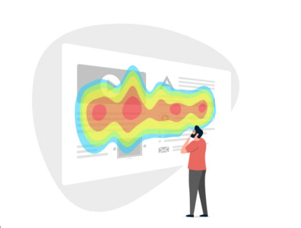 Despite their many advantages, it’s important to note that heat maps do not explain why users behave in a certain way; they only show what actions are taken. Here are some of the many benefits that these tools offer: Passive Data Collection: One of the primary benefits of heat maps, especially click-and-scroll heat maps, is their ability to passively collect data on how users interact with various elements on a webpage. This data is invaluable for analyzing user experience and the customer journey, relying on actual user behavior rather than assumptions. Immediate Visual Insights: Heat maps provide instant visual cues about which parts of a webpage are engaging users the most. For example, if a heat map shows that users are not clicking on a designated CTA button but are instead trying to click on an element that isn’t interactive, it indicates a possible area for optimization. In-depth Page Analysis: Heat maps allow for a detailed examination of how much and which parts of the page visitors interact with. This analysis can reveal which sections of content your audience finds most interesting and useful and which are ignored. With a clear understanding of these interactions, you can adjust your content strategy to match user interest better and position essential elements like CTA buttons in areas where they are more likely to be noticed and acted upon. Support for A/B Testing and UX Decisions: The information gained from heat maps can guide A/B testing and UX decisions, enabling marketers to make required changes that upgrade page effectiveness and conversion rates. For example, by identifying where users spend most of their time, marketers can strategically place important content or offers in these "hot areas" to increase interaction.
 Questions Heat Maps Help Answer
Heat maps address critical questions about user behavior on a page to make more informed decisions, such as:- How are visitors actually using the site?
- What catches their attention, and where do they click?
- Which elements of the page are they ignoring?
- Is the copy engaging enough?
- Where should essential page elements be placed so that they are not overlooked?
Role of Heat Maps in SEO
Heat maps play an important role in SEO by visually showing where users focus their attention on a website. These tools use colors to indicate areas of high and low activity. For example, warm colors like red might show where most users click or spend time, while cooler colors like blue show less activity. This visual data helps understand what parts of a website are appealing to users and which parts are being overlooked. For instance, if a heat map shows that a good offer or promotion is being ignored, it can be moved to a hotter area where more users tend to click.
How Heat Maps Can Improve SEO Strategies
The color-coded data visualization through heat maps makes it easy to identify patterns and areas of a page that are performing well or underperforming. Let's understand how heat maps can be useful for refining your SEO efforts: